Countries React App
Last updated on
Overview
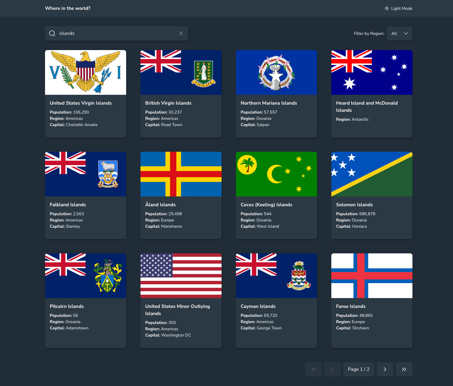
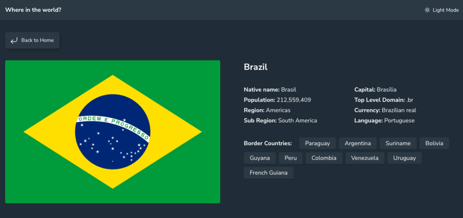
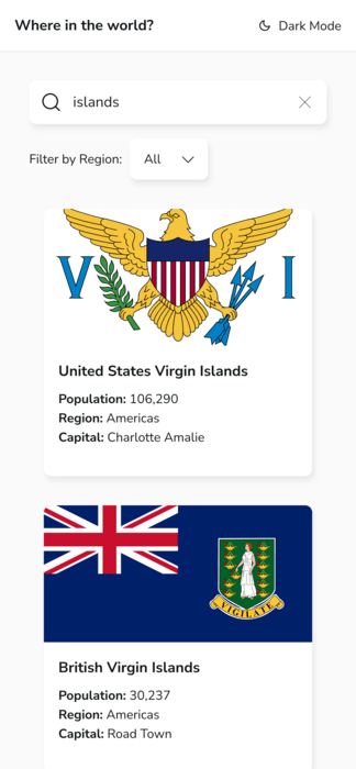
An interactive app that lets users browse, search, and filter countries from the REST Countries API. Users can view country details, explore bordering nations, and switch between light and dark themes.
Background
This project started as an independent build after the first few chapters of The Joy of React. The goal was to apply recently learned fundamentals - composition, hooks, state, effects - to a real API-driven app, without step-by-step guidance.
I found Frontend Mentor’s REST Countries challenge and used it as a base to practise structuring a React app, organising state, and handling asynchronous data.

Features
- Browse and search countries from the REST Countries API
- Filter by region
- View country details, including border countries
- Toggle between light and dark mode
- Pagination for large result sets
- Local fallback data when the API fails
Tech Stack
- React (built with hooks, and custom hooks)
- Styled Components for styling and theming
- Manual project setup with Parcel (no CRA/Vite) to understand tooling basics
- Semantic HTML and accessibility best practices
- CSS Grid and Flexbox for layout

Key Learnings
- Project setup and structure: configuring a React app from scratch, organising helpers, constants, and component files.
- Component design: breaking down a large “main content” component into smaller, focused parts.
- React patterns: prop delegation, effects with cleanup, memoisation, and derived state.
- Styling: using
ThemeProviderfor consistent theming, experimenting with design tokens and reusable styled components. - Accessibility: improving keyboard navigation and semantics using utilities like
VisuallyHidden. - Resilience: handling API timeouts and error states gracefully.
Code Highlight: Handling Fetch Timeouts
One of the most satisfying parts of the build was improving how the app handled unreliable API responses. I used an AbortController to cancel requests after 5 seconds and fall back to local data - making the UI feel more resilient.
This helped me understand cleanup functions, error handling, and how to think about failure states when fetching data in a React app.
Continued Development
- Improve accessibility (e.g. using
prefers-reduced-motionandprefers-color-scheme). - Add sorting (by country name or population).
- Improve the design system further (rework elevation and shadows for dark mode).
- Refine the CSS (fluid spacing, CSS variable organisation).
- Simplify state flow - possibly using context for the search form.
Reflection
Building this app was slow at first - starting from a single component and gradually shaping it into something structured. By the end, I'd like to think I not only improved my understanding of how React works, but improved my ability to think in React: how to build incrementally, abstract intentionally, and handle edge cases with care.
Links
- Live site: fabulous-dodol-b93b05.netlify.app
- Source code: GitHub
The Nifty Select
One of my favourite bits was the custom Select component - a pattern where the native select remains accessible, but is hidden behind a styled “presentational” layer.
This pattern enabled me to control the styling completely while keeping accessibility intact. It's more of a CSS thing than a React thing, but the idea that you can separate function from presentation, was a real eye-opener, and made me think about how you can design for both when building certain components.
The Unnecessary Effect Refactor
As I later learned more about React, I came across You Might Not Need an Effect and realised I could simplify a part of the app. Originally, pagination reset in an effect:
Using the ideas in the article and refactoring it into event handlers instead:
This change helped me understand that not all state changes belong in effects. Effects should handle external side effects - like fetching data or syncing with the DOM - not simple internal updates. By moving this logic into handlers, the app became more predictable and explicit: state updates now happen directly as a result of user actions, rather than reactively after render.